As the world becomes increasingly mobile, it’s essential for businesses and individuals to ensure that their Google Sheets are accessible and user-friendly on mobile devices. With the rise of smartphones and tablets, more people are accessing data and performing tasks on-the-go. However, traditional Google Sheets can be challenging to navigate and use on smaller screens, leading to frustration and decreased productivity. In this comprehensive guide, we’ll explore the importance of making Google Sheets mobile-friendly and provide step-by-step instructions on how to achieve this goal.
Google Sheets is a powerful tool for data analysis, collaboration, and visualization. It offers a wide range of features, including real-time collaboration, automatic saving, and seamless integration with other Google apps. However, when it comes to mobile devices, Google Sheets can be a bit clunky. The interface is not optimized for smaller screens, making it difficult to navigate and use on-the-go. This can lead to decreased productivity, frustration, and a negative user experience.
So, why is it essential to make Google Sheets mobile-friendly? Here are a few reasons:
- Increased productivity: By making Google Sheets mobile-friendly, users can access and work on their data anywhere, anytime, leading to increased productivity and efficiency.
- Improved user experience: A mobile-friendly Google Sheets interface ensures that users can easily navigate and use the tool, leading to a positive user experience and reduced frustration.
- Enhanced collaboration: With a mobile-friendly Google Sheets, team members can collaborate and work on data in real-time, regardless of their location or device.
- Better data analysis: A mobile-friendly Google Sheets enables users to access and analyze data on-the-go, leading to better decision-making and informed business strategies.
Understanding Mobile-Friendly Design Principles
Before we dive into the steps to make Google Sheets mobile-friendly, it’s essential to understand the key design principles involved. A mobile-friendly design should prioritize simplicity, clarity, and ease of use. Here are some key principles to keep in mind:
- Simplify the interface: A mobile-friendly Google Sheets should have a clean and simple interface that eliminates clutter and distractions.
- Use clear typography: Clear and legible typography is essential for a mobile-friendly design. Use a font size that’s easy to read on smaller screens.
- Make it touch-friendly: A mobile-friendly Google Sheets should be designed for touch input, with large buttons and intuitive gestures.
- Use high-contrast colors: High-contrast colors can help improve readability and make the interface more accessible.
- Optimize for smaller screens: A mobile-friendly Google Sheets should be optimized for smaller screens, with a focus on vertical scrolling and minimal horizontal scrolling.
Designing a Mobile-Friendly Google Sheets Interface
Now that we’ve covered the key design principles, let’s dive into the steps to design a mobile-friendly Google Sheets interface. Here are some tips to get you started:
- Use a responsive design: A responsive design ensures that the interface adapts to different screen sizes and devices.
- Use a single-column layout: A single-column layout is ideal for mobile devices, as it eliminates clutter and makes the interface easier to navigate.
- Use large buttons and intuitive gestures: Large buttons and intuitive gestures make it easy for users to interact with the interface.
- Use clear and concise labels: Clear and concise labels help users understand what each button or feature does.
- Use high-contrast colors: High-contrast colors can help improve readability and make the interface more accessible.
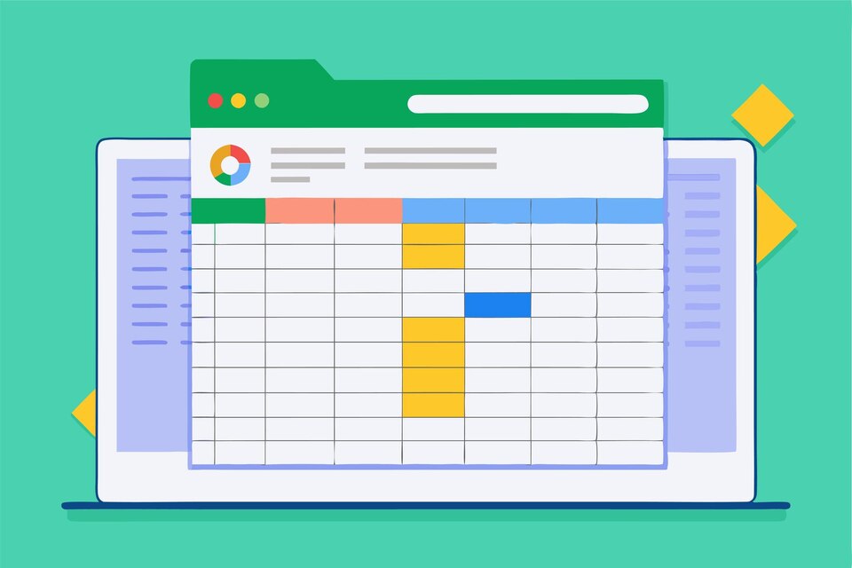
Example of a Mobile-Friendly Google Sheets Interface
| Feature | Design Principle | Example |
|---|---|---|
| Single-column layout | Simplify the interface |  |
| Large buttons | Make it touch-friendly |  |
| Clear and concise labels | Use clear typography |  |
Optimizing Google Sheets for Mobile Devices
Now that we’ve covered the design principles and interface design, let’s dive into the steps to optimize Google Sheets for mobile devices. Here are some tips to get you started: (See Also: How to Auto Fill Time in Google Sheets? Simplify Your Workflow)
- Use the mobile app: The Google Sheets mobile app offers a more streamlined and intuitive interface than the web app.
- Use the “Mobile” view: The “Mobile” view in Google Sheets allows you to switch to a mobile-friendly interface.
- Use the “Full screen” mode: The “Full screen” mode in Google Sheets allows you to remove distractions and focus on the data.
- Use the “Zoom” feature: The “Zoom” feature in Google Sheets allows you to zoom in and out of the interface.
- Use the “Keyboard” feature: The “Keyboard” feature in Google Sheets allows you to access a virtual keyboard for easier data entry.
Using the Google Sheets Mobile App
The Google Sheets mobile app offers a more streamlined and intuitive interface than the web app. Here are some features to explore:
- Real-time collaboration: The Google Sheets mobile app allows for real-time collaboration and commenting.
- Automatic saving: The Google Sheets mobile app automatically saves changes as you work.
- Seamless integration: The Google Sheets mobile app integrates seamlessly with other Google apps, such as Google Drive and Google Docs.
- Offline access: The Google Sheets mobile app allows you to access and edit Google Sheets offline.
Best Practices for Mobile-Friendly Google Sheets
Here are some best practices to keep in mind when creating a mobile-friendly Google Sheets:
- Keep it simple: A mobile-friendly Google Sheets should have a clean and simple interface that eliminates clutter and distractions.
- Use clear typography: Clear and legible typography is essential for a mobile-friendly design. Use a font size that’s easy to read on smaller screens.
- Make it touch-friendly: A mobile-friendly Google Sheets should be designed for touch input, with large buttons and intuitive gestures.
- Use high-contrast colors: High-contrast colors can help improve readability and make the interface more accessible.
- Optimize for smaller screens: A mobile-friendly Google Sheets should be optimized for smaller screens, with a focus on vertical scrolling and minimal horizontal scrolling.
Common Mistakes to Avoid
Here are some common mistakes to avoid when creating a mobile-friendly Google Sheets:
- Using a cluttered interface: A cluttered interface can be overwhelming and difficult to navigate on smaller screens.
- Not using clear typography: Clear and legible typography is essential for a mobile-friendly design. Use a font size that’s easy to read on smaller screens.
- Not making it touch-friendly: A mobile-friendly Google Sheets should be designed for touch input, with large buttons and intuitive gestures.
- Not using high-contrast colors: High-contrast colors can help improve readability and make the interface more accessible.
- Not optimizing for smaller screens: A mobile-friendly Google Sheets should be optimized for smaller screens, with a focus on vertical scrolling and minimal horizontal scrolling.
Conclusion
Creating a mobile-friendly Google Sheets requires careful consideration of design principles, interface design, and optimization for mobile devices. By following the tips and best practices outlined in this guide, you can create a Google Sheets that is accessible, user-friendly, and optimized for mobile devices. Remember to keep it simple, use clear typography, make it touch-friendly, use high-contrast colors, and optimize for smaller screens. By doing so, you can ensure that your Google Sheets are accessible and usable on-the-go, leading to increased productivity, improved user experience, and enhanced collaboration. (See Also: How to Get Rid of Borders in Google Sheets? Simplify Your Spreadsheets)
Recap
In this comprehensive guide, we’ve covered the importance of making Google Sheets mobile-friendly, design principles, interface design, and optimization for mobile devices. We’ve also explored the Google Sheets mobile app, best practices, and common mistakes to avoid. By following the tips and best practices outlined in this guide, you can create a Google Sheets that is accessible, user-friendly, and optimized for mobile devices.
Frequently Asked Questions
FAQs
Q: What is the best way to make Google Sheets mobile-friendly?
A: The best way to make Google Sheets mobile-friendly is to use a responsive design, simplify the interface, use clear typography, make it touch-friendly, use high-contrast colors, and optimize for smaller screens.
Q: How can I optimize Google Sheets for mobile devices?
A: You can optimize Google Sheets for mobile devices by using the mobile app, using the “Mobile” view, using the “Full screen” mode, using the “Zoom” feature, and using the “Keyboard” feature.
Q: What are some common mistakes to avoid when creating a mobile-friendly Google Sheets?
A: Some common mistakes to avoid when creating a mobile-friendly Google Sheets include using a cluttered interface, not using clear typography, not making it touch-friendly, not using high-contrast colors, and not optimizing for smaller screens.
Q: How can I ensure that my Google Sheets are accessible and usable on-the-go?
A: You can ensure that your Google Sheets are accessible and usable on-the-go by following the tips and best practices outlined in this guide, including using a responsive design, simplifying the interface, using clear typography, making it touch-friendly, using high-contrast colors, and optimizing for smaller screens.
Q: What are some benefits of making Google Sheets mobile-friendly?
A: Some benefits of making Google Sheets mobile-friendly include increased productivity, improved user experience, enhanced collaboration, and better data analysis.